Beautiful feedback to events with ease
🍞 Toaster
The toaster component emits toasts 🍞🔥 You generally want a single toaster at the root of your application. Toasts are emitted by the context provided by the toaster.
Get started
Step 1: Install the package. then add the toaster component towards the root of your app (usually on a page)
.png/public)
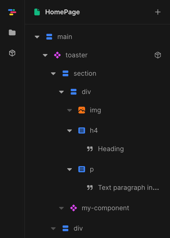
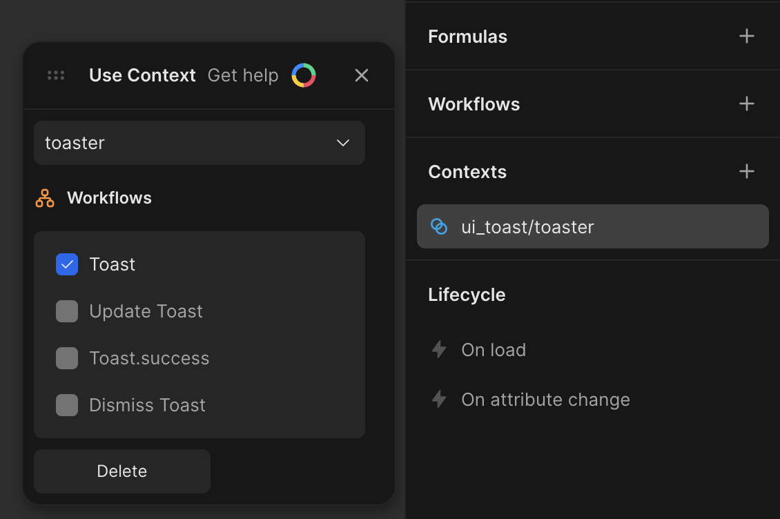
Step 2: Subscribe to the context in any subcomponent, at any depth (in this example: the "my-component")
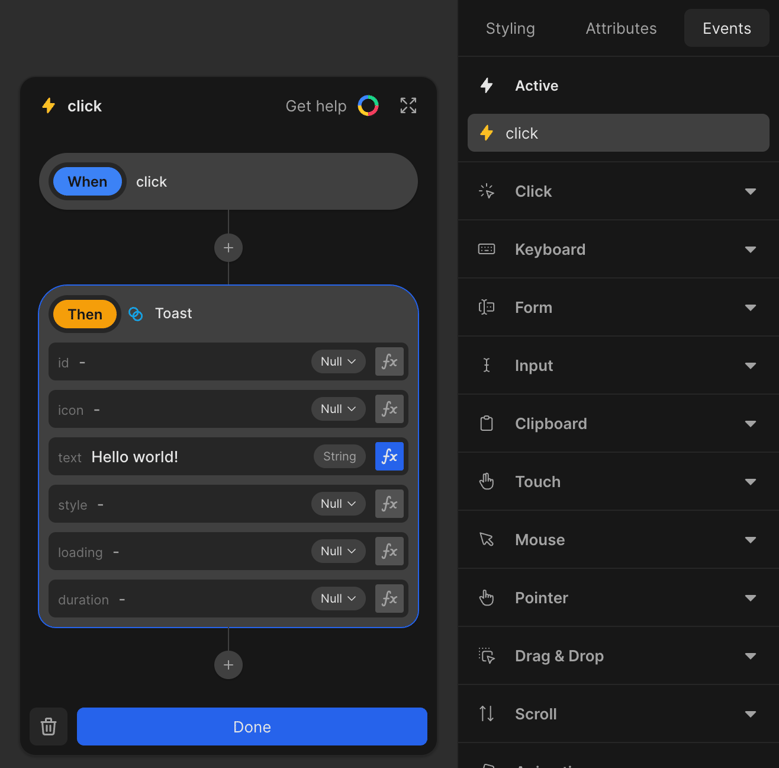
Step 3: Call the workflow in your component(s) to show toasts
Notice: Testing from the editor within the component may not work, as it requires the Toaster to component. Test either in preview or from the parent component that holds the Toaster.
Step 4: Profit
See the example demo project
Attributes
position combination of vertical position "top", "bottom" and horizontal "left", "center", "right". Default is "top center" absolute Should the toasts be contained in the toaster or to the screen (leave empty for screenspace) offset How many pixel to leave to the edge? Default is 16 Context workflows
Toast Trigger a toast to be shown. You can set various options such as a timeout and custom styling. Styling is an object with key value CSS rules. Toast.success Same as `toast`, but with some default settings to show successful feedback Update toast Update a toast based on its key Dismiss toast Dismiss a toast based on its key
I'm still improving and adding functionality to this package. Please leave me feedback and requested features on the toddle Discord @jacobkofoed